Ballerina Loft is one of my best works which took second place in Evermotion Challenge 2015 "Whola Lotta Loft!"

Have a look at the making-of for this scene which was initially published on Evermotion website.
I used #Autodesk #3DStudioMax and plugins, #MarvelousDesigner and #ZBrush for #modelling, #coronarender and #Photoshop and plugins for the #postproduction. Those were my early days using #Corona so during this project I was also learning more about the lighting, materials and settings of this physically-based render while experimenting with my image.
These are the words of the competition jury about my visualisation:
What to say about this wonderful kind of piece of art. Clear winner for me. From the comp to the magnificent colour palette going through a absolutely peaceful sense of lighting. Simply beautiful. - Alex Roman.
Definitely my favourite work! This is not simply beautiful, and technically stunning. The concept is fully respected and the colours are perfectly managed. This is Magic! - Ciro Sannino
The idea of your loft is very interesting (...) I like the feminine touch though and a huge plus is that there is no intrusive post-production. Good light balance and models! Keep it up! Cheers! - Michał Horba.
Very solid work, good lighting, many details, great quality - Kuba Dąbrowski.
Outstanding work with innovative approach to the loft theme. Charming picture with its unique mood created by the snowy winter outside, a pleasant mild light and pastel colours of the room. Tells a lot about a person who lives in there. The author at the same time presents wide variety of technical skills: hard and organic modelling, cloths, shading and texturing with attention to details. Well done! - Barbara Witkowska.
“What to say about this wonderful kind of piece of art. Clear winner for me. From the comp to the magnificent colour palette going through a absolutely peaceful sense of lighting. Simply beautiful. - Alex Roman”
As when painting (which was my BA degree), my process consists of working on everything at the same time. When painting, after drawing the shapes, you start applying the main shades of light and dark paint in thin layers to block out the main shapes so that the colour circulates all across the canvas resulting a unitary composition. I start modelling but at the same time begin texturing, lighting and making early render tests to check the overall result throughout the project.
References
Looking for inspiration, I found an article on an interior design blog called "How to live in the sky" by DECOsash. I thought that it sounded so poetic and romantic and the editorial was perfect in terms of aesthetics but also had the potential to express the character of the person living there. I decided to develop my own concept and story around the idea that a #ballerina lives in this space and the goal of letting the viewer feel her presence in the room. The general look of the editorial is the trendy #Scandinavian style of #loft design, which I love, but I wanted to go past the arranged look of an editorial and create a natural look - a bit messy but at the same time delicate and feminine.
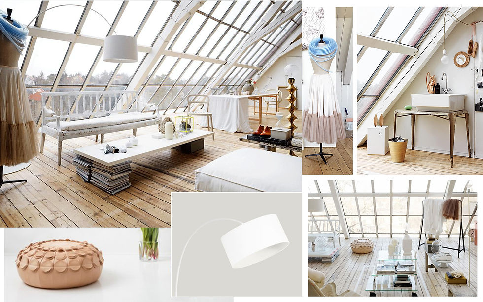
I wanted the viewer to almost smell her perfume in the air while having a sense of what that space means for her - letting go of the stress accumulated during the long hours of practice and being able to relaxing her painful feet, read magazines and drink tea.
I think research is the key for any project so I looked again at Degas paintings (the master of the ballerinas depiction), watched films and found many, many photos with ballerinas during this time. It's more accurate to say I attained that look rather then choosing it as it was a process where the work developed.
3D Modelling
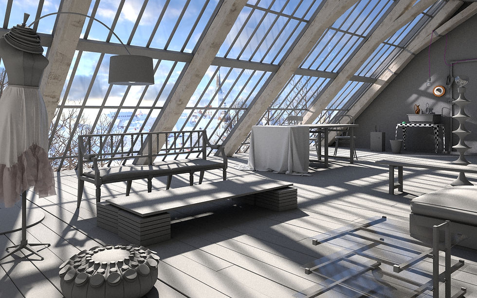
First I modelled the structure I had seen in the picture, trying to guess the dimensions and using a biped as a helper to keep it all in scale. I exaggerated the number of windows as my personal intervention to give it a wider feel and make it look more sophisticated.


Next, I detailed the objects in the scene one by one, starting with the objects closest to the camera. Meanwhile, I kept changing the HDRI and sun intensity and position looking for the best lighting and shadows that would give more 'charm' to the scene.
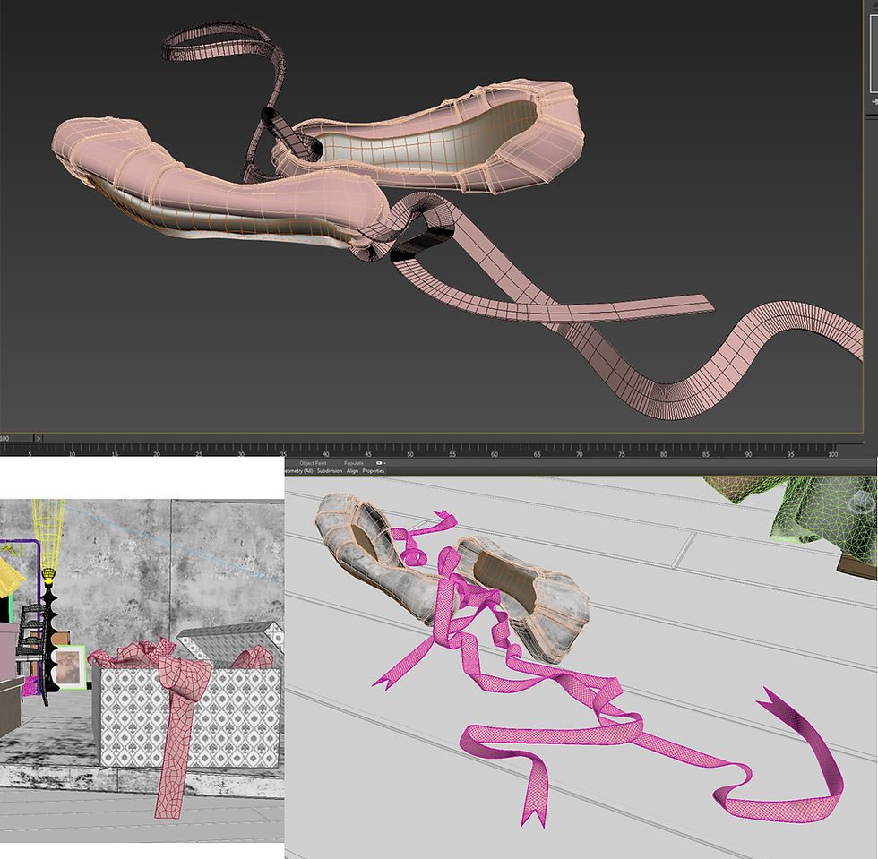
More modelling examples for different objects in the scene:

I modelled 2 different pairs of pumps, the ones for the close-up and the others hanging above the door in the far plane of the image.


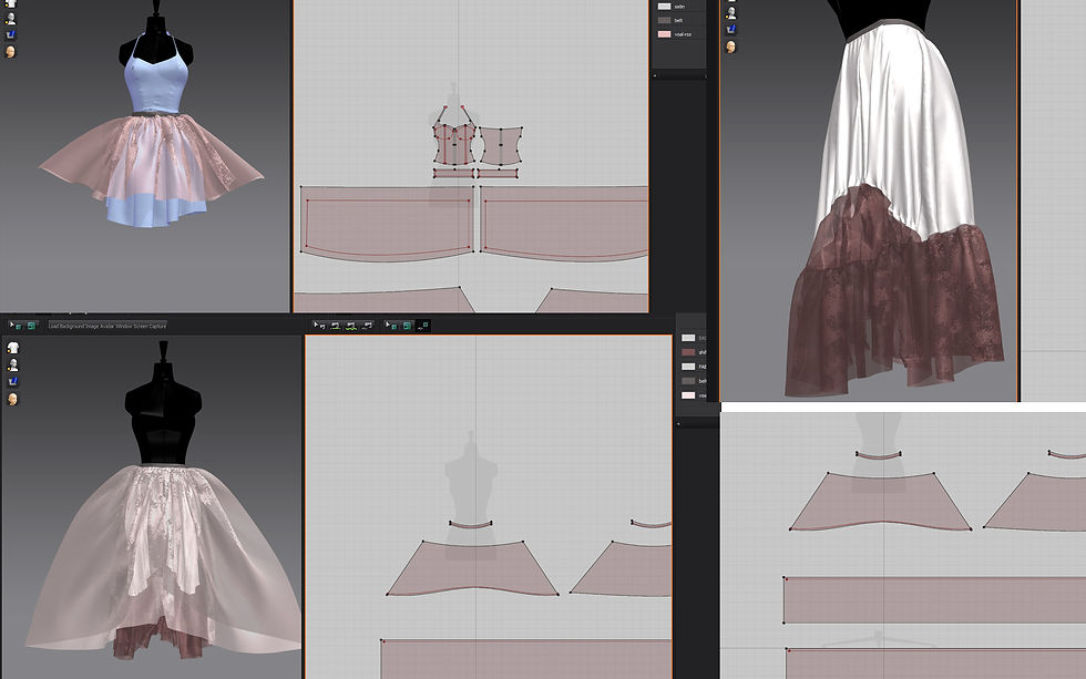
Cloth simulation with Marvellous Designer
I used #MarvelousDesigner for creating the cloth simulations and, although I have used this software many times before, making dresses and skirts was a new experience for me. It was really fun but equally challenging because in real life I'm not even capable of sewing :)


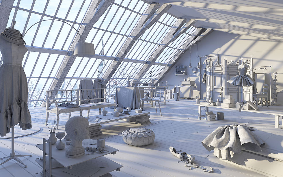
I modelled all the elements that were relevant for the scene and helped to tell the story. I think that no matter how brilliant the libraries of models are that you can now find, when you try to make something personal, modelling is one of the ways you can express yourself. Even if you try to make things looking realistic, each person will see reality in his or her particular way. I enjoy modelling for this reason as an image can still have that human touch even though the render is produced using a computer. I also believe in using ready made models but, when I do use them, I modify something even if it's only the mapping or adding small personal touches to turn that model into my own.
Lighting
Lighting was the most engaging and challenging aspect. I changed it dozens of times over the course of the project trying lots of different HDRI images, sun positions and settings until I had a result that I was satisfied with.

Lighting setup 1

Lighting setup 2
For the final lighting set-up I only used the sun visible directly, the HDRI for the environment and the artificial lights for the lamps.

I used the image I choose for the outside view only on visibility override but the reflections and refraction came from the HDRI and direct light from the sun.

Materials
Because I used Corona as my rendering engine, I needed to learn a lot about materials while experimenting with my image. I had a lot of support from the Corona community so I would like to thank everybody contributing to the website http://coronamaterials.com/.

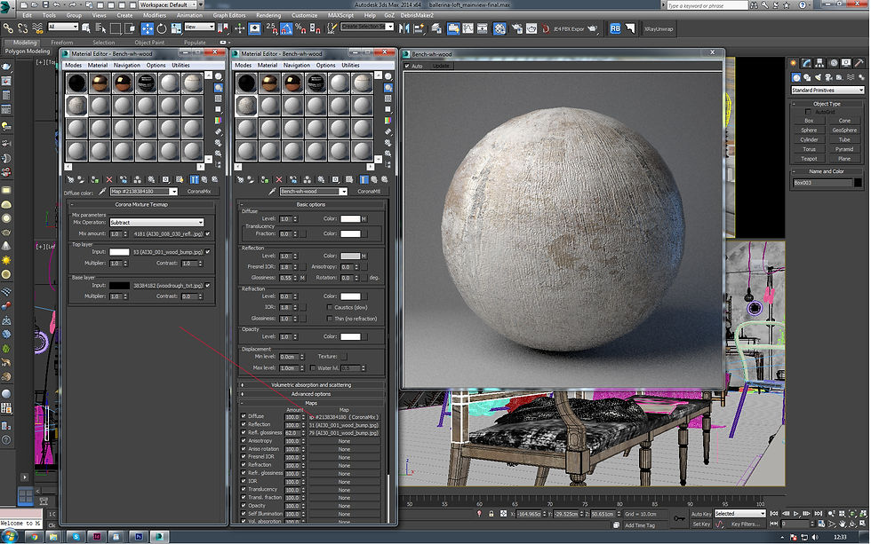


Another challenging issue for me during this project was to create the windows that looked realistic so I had many trial and error attempts to obtain the frosted window effect.

Rendering
I used a V-ray camera for the scene because I was already familiar with it and I prefer it to the basic camera because it has the tilt shift option which I find very useful. However, the main rendering settings in Corona are controlled from the render dialog, so I experimented with the DOF enabled and also disabled and also played with the photographic settings.


Post production
Post was the simplest part. Usually I save the image as .exr to have more flexibility in adjusting the exposure and balance. The image for the outside view was added in Photoshop to have more control over adjusting it separately.


This is just an example of 100% render detail without the DOF:
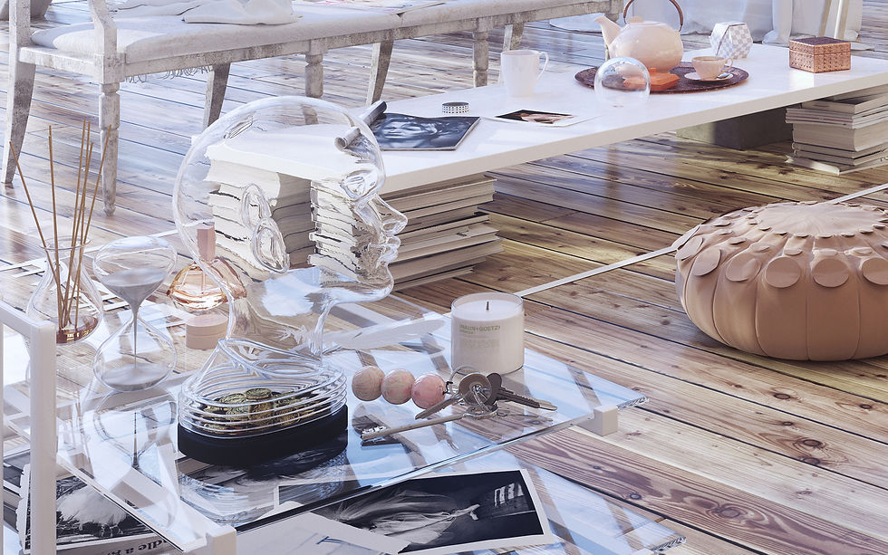
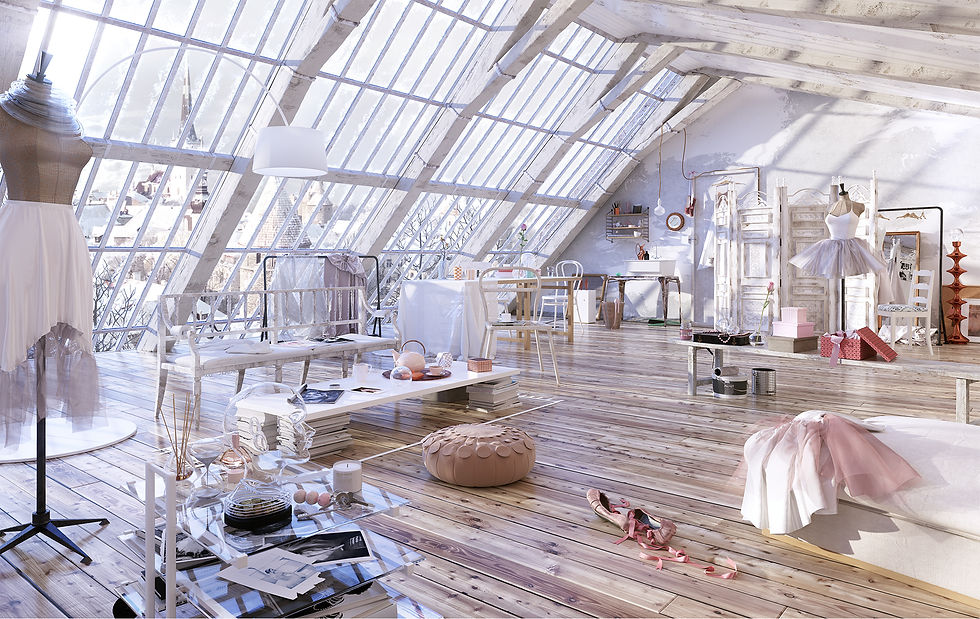
At the end I added a touch of Knoll Light Factory filter just to point out how blinding the wintery light can be (top left corner).
A time consuming issue was rendering the scene twice at 5000x8000 pixels (with DOF and without) on only one machine.
This scene took me about two months to complete (December 2015 and January 2016). I kept updating my thread on the Evermotion forum so I worked on it almost all throughout the entire time of the competition because I wanted to make the most out of this time. I also modelled a bed in another area of my loft and rearranged the assets in a few new compositions that I rendered during this time.
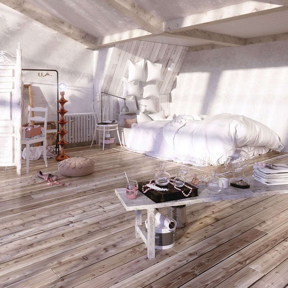
Other alternative views:

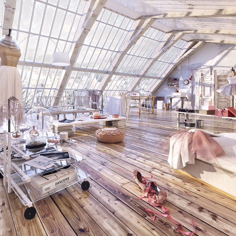
Ballerina Loft scene was published in 3D Artist Magazine at Gallery/In depth, issue 91(2016), pages 18, 19 and 20. I also had the opportunity to be published in the InCG Magazine Taiwan (2016), at the Showcase page featuring my artist profile in Chinese. Then last year I had the amazing surprise my work won the People's Choice award at 3D Individual category and be published in the Creativepool Annual 2017.
I played with this scene a lot and I was lucky to have been able to set aside all of this time for it without client pressure or the stress of a job but only the competition pressure which actually kept me alert and keen to be at my best.
Thank you so much for viewing and for following my blog! Comments and questions are welcome!
ความคิดเห็น